Themes
The Themes page has been redesigned to make managing your location and information bar themes easier than ever. From a single page, you can create, edit, and manage themes that control the appearance of your digital signage experience, helping you maintain consistent branding across your locations.
Themes are divided into two categories:
- Location Themes - Control the look and feel of your digital signage displays, including fonts, colours, logos, backgrounds, and display features.
- Info Bar Themes - Control the appearance of tickers and full-screen alerts displayed through the Information Bar.
Accessing Themes
- Navigate to System Settings from your Vibe portal.
- From the left-hand menu, select Site Settings.
- Click Themes.
The Themes page displays two separate theme management areas:
- Location Themes (left panel)
- Info Bar Themes (right panel)
Use the search bars to quickly find existing themes.
Location Themes
Location Themes determine the visual styling applied to your digital signage displays. This includes branding elements such as logos, colour palettes, fonts, backgrounds, and display options.
From the Location Themes panel, you can:
- View all available location themes
- Search for specific themes
- Edit existing themes
- Manage location assignments
- Configure theme appearance and display settings
 Learn more about: Location Theme
Editing a Location Theme
Selecting a Location Theme opens the Edit Location Theme window.
Within this window, you can configure:
Theme Name
The theme name is used to identify the theme within Vibe.
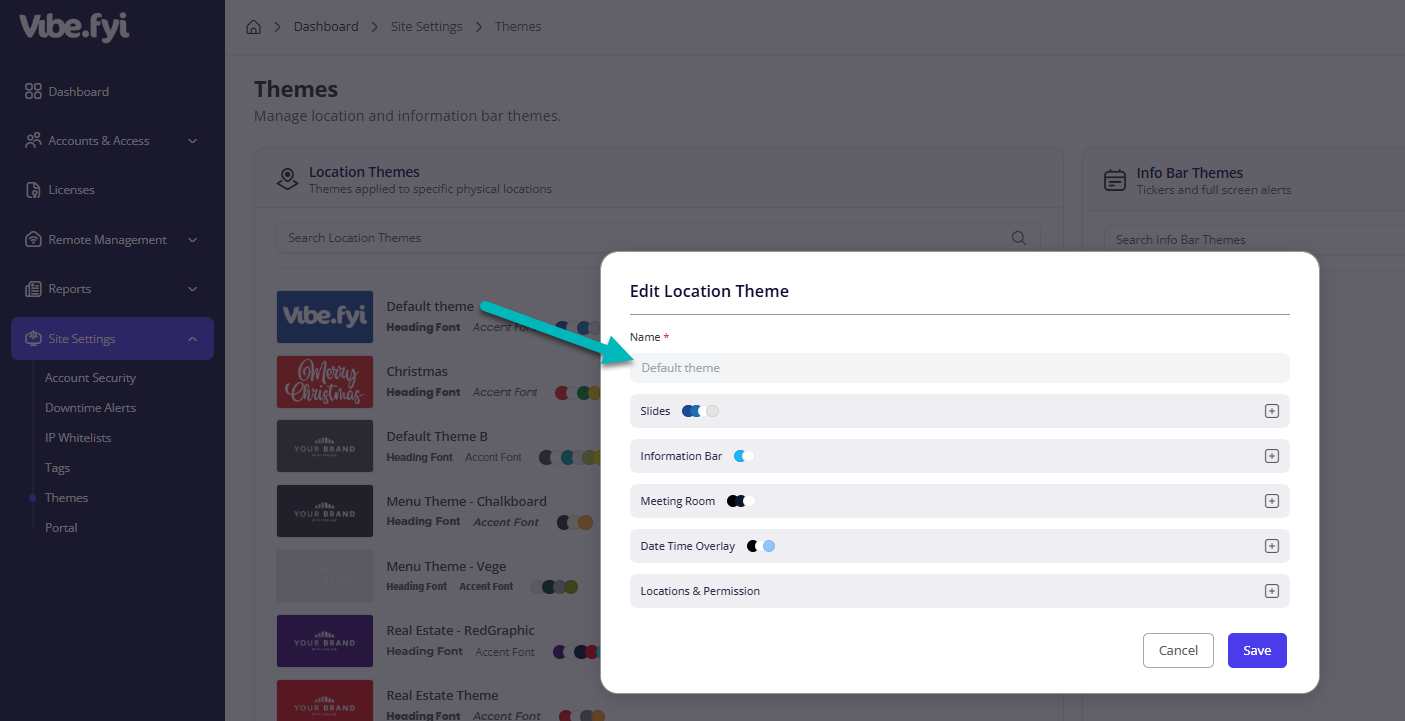
The Default Theme is the primary theme applied to slides within the Vibe Portal. This theme is used as the default styling option when creating or managing slide content unless another theme has been selected. To maintain system consistency, the Default Theme name cannot be edited. While the theme's appearance and settings can be customized, the theme name will remain fixed.
 Only custom themes can be renamed. The Default Theme will always display as Default Theme throughout the platform.
Slides
This section allows you to customize the visual appearance of slides displayed at assigned locations.
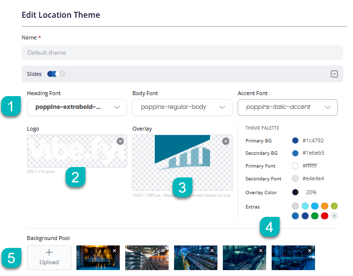
I. Fonts
Choose the typography used across slide content.
Available options include:
- Heading Font – Used for slide titles and major headings.
- Body Font – Used for descriptions and general content.
- Accent Font – Used for highlighted text and decorative elements.
Using consistent fonts helps maintain a professional and branded appearance throughout your content.
Learn more about: Fonts
II. Logo
Upload a logo to display on screens using the selected theme.
The logo is used to reinforce branding and will appear in your slides.
Learn more about: Logo
III. Overlay
Upload an overlay graphic that appears on top of screen content.
Overlays are commonly used for:
- Branded screen designs
- Decorative borders
- Custom visual elements
- Corporate styling requirements
Learn more about: Overlay ImageIV. Theme Palette
The Theme Palette controls the colours used throughout your slides.
Configure:
- Primary Background Colour
- Secondary Background Colour
- Primary Font Colour
- Secondary Font Colour
- Overlay Colour and Opacity
- Additional Accent Colours
Learn more about: Brand ColoursV. Background Pool
The Background Pool contains images available for use by the theme.
Administrators can:
- Upload new background images
- Remove existing images
- Maintain multiple branded backgrounds
Learn more about: Background ImagesInformation Bar
The Information Bar panel allows you to customize the appearance of the information bar displayed on your digital signage.
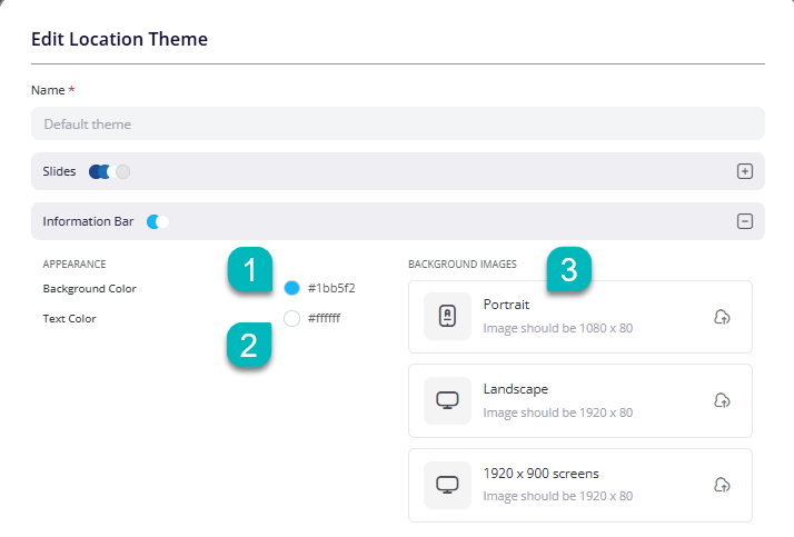
- Background Color - Set the background color of the information bar.
- Text Color - Customize the color of the text displayed on the information bar.
- Background Images - Upload images to customize the information bar background for different screen orientations and sizes:
- Portrait:1080 × 80 px
- Landscape: 1920 × 80 px
- 1920 × 900 Screens: 1920 × 80 px
If no background images are uploaded, the information bar will use the selected Background Color by default.
Learn more about: Information Bar, Info Bar Admin Settings
Meeting Room
Customize the appearance of the Meeting Room display through the following options:
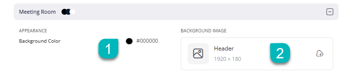
- Background Color: Choose a background color for the display.
- Background Image: Upload a custom header image (1920 × 180) to personalize the screen.
Learn more about: Meeting Room Signage
Date Time Overlay
Customize how the date and time appear on your digital signage screens using the following options:
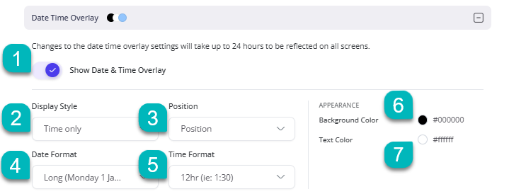
- Enable/Disable: Show or hide the Date & Time Overlay.
- Display Style: Choose how the date and time will be displayed.
- Position: Set where the overlay appears on the screen.
- Date Format: Select your preferred date display format.
- Time Format: Choose between 12-hour and 24-hour format.
- Background Color: Customize the overlay's background color.
- Text Color: Change the color of the displayed date and time.
Note: Changes to the Date & Time Overlay settings may take up to 24 hours to reflect on all screens.
Learn more about: Date Time Overlay
Locations & Permission
Manage where the theme applies and who can access or manage it through the following options:

- Locations: Select the specific location where the theme will be applied.
- Permission: Assign permission groups to control user access to the theme.
Note: The Default Theme does not have a Location field because it serves as the system-wide default theme and automatically applies to all slides.
Info Bar Themes
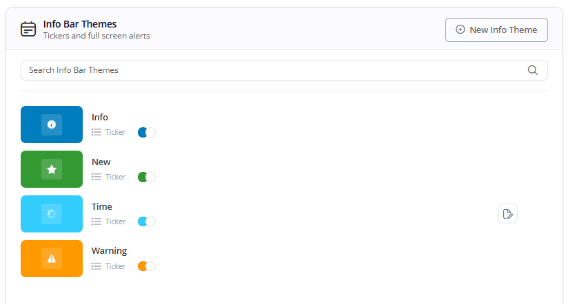
Info Bar Themes control the appearance of ticker messages and full-screen alerts displayed through the Information Bar.
These themes help users quickly identify different types of messages using colours and icons
Creating an Info Bar Theme
Select New Info Theme to create a new Information Bar Theme.
Editing an Info Bar Theme
Selecting an existing Info Bar Theme opens the Edit Information Bar Theme window.
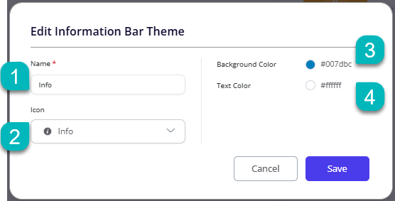
Within this window, you can configure:
- Name: Provide a name that clearly identifies the purpose of the Information Bar Theme.
- Icon: Select an icon that visually represents the message category. Icons help viewers quickly recognise the importance or purpose of displayed messages.
- Background Color: Choose the background colour displayed behind the message. Colour coding can help distinguish different communication types.
- Text Color: Select the text colour used within the Information Bar. Choose colours that provide strong contrast and readability against the selected background colour.
Learn more about: Information Bar, Info Bar Admin SettingsThis article provides an overview of the Themes page and its available options. For detailed instructions on specific features, refer to the related articles linked throughout this guide.